Best Calming Color Palettes for a Restful, Peaceful Home

Color is the quietest yet most powerful decorating decision you’ll ever make. Long before you notice the furniture or the art, the colors on your walls and in your textiles are shaping how you feel, nudging you toward energy or ease, tension or calm. If you long for a home that helps you exhale the moment you walk in, choosing the right calming color palette is the simplest and most affordable place to begin.
In this guide, you’ll discover the best calming color palettes for a restful, peaceful home, from soothing blues and soft greens to warm neutrals and grounding earth tones. You’ll learn the psychology behind why each one works, how to combine them into a cohesive scheme, and how to apply them room by room, so any home of any size can feel like a genuine sanctuary.
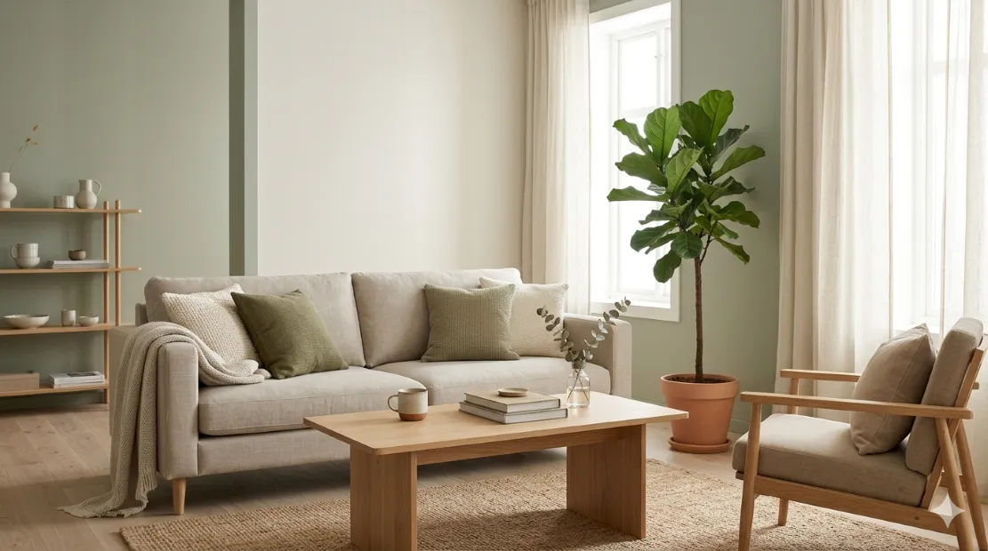
Understanding why color affects us so deeply makes choosing easier. Our responses to color are partly instinctive and partly learned: we associate soft blues and greens with sky, water, and foliage, signals of a safe, restful natural environment, while warm neutrals echo sand, stone, and wood. Bright, highly saturated colors demand attention and feel stimulating, which is wonderful for a playroom but draining for a space meant to restore you. A calming palette works by lowering that visual intensity, giving your eyes and mind less to process and more room to settle.
Soothing Blues: The Most Restful Family
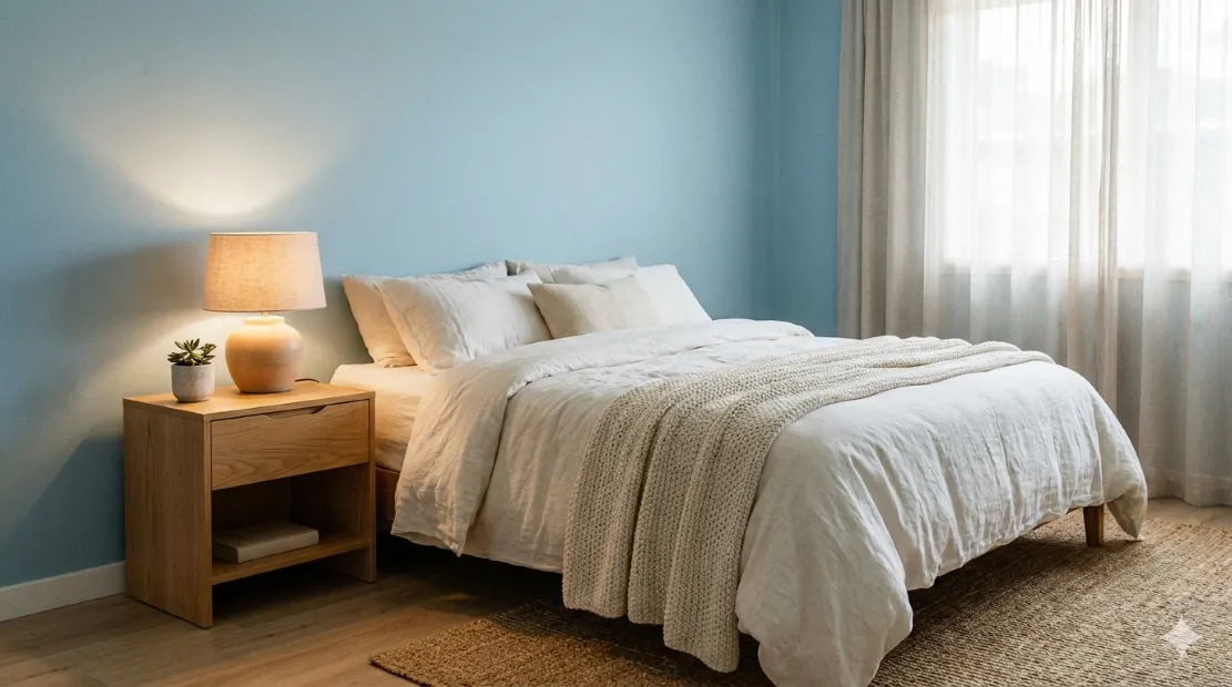
If there is one color universally linked with calm, it’s blue. Soft, muted blues are associated with a slower heart rate and a settled mind, which is exactly why they’re so often recommended for bedrooms and bathrooms. Think less of bold navy or electric cobalt and more of misty sky blue, soft powder, dusty denim, and gentle blue-gray. These quiet shades evoke clear skies and still water, wrapping a room in a sense of serenity without ever feeling cold when balanced correctly.
To keep blue from tipping into chilly or clinical, pair it with warm companions. A soft blue wall comes alive against warm white trim, natural wood, and creamy linen textiles, and a touch of warm metal like brass adds gentle contrast. This balance of cool and warm is the secret to a blue scheme that feels like a peaceful retreat rather than a cold office. Layering a few different tones of the same blue, from pale to slightly deeper, adds quiet depth while preserving the soothing effect.
Soft Greens: Nature’s Balm
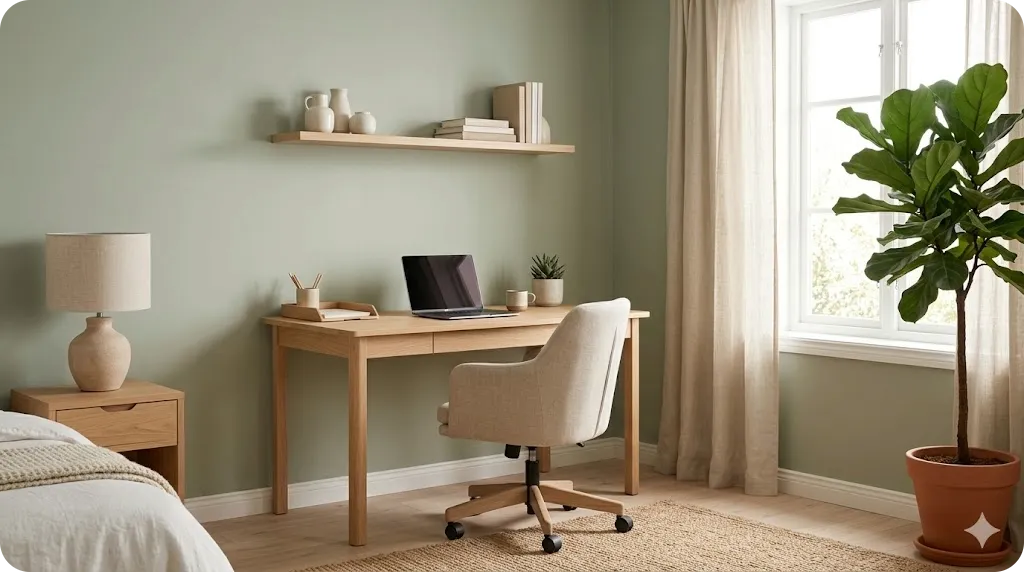
Green sits at the restful center of the spectrum and carries the deepest connection to nature, which is why it feels so instantly soothing indoors. Muted, earthy greens like sage, eucalyptus, soft olive, and gentle moss bring the calm of a garden inside without overwhelming a space. Because green is so closely tied to growth and renewal, it strikes a rare balance: restful enough for a bedroom, yet fresh and uplifting enough for a living room, kitchen, or home office.
One of green’s great strengths is how naturally it pairs with other calming elements. It sits effortlessly beside warm woods, woven textures, and stone, and it harmonizes with both warm neutrals and soft blues. For a layered, organic feel, combine a sage wall with cream and oatmeal textiles, natural wood furniture, and a few real plants that echo the wall color. The result is a space that feels alive and grounded at once, like a quiet corner of the outdoors brought inside.
Smart Small Space Tip: Always test paint colors on your actual wall before committing, and look at the sample in morning, afternoon, and evening light. Calming colors, especially blues and greens, shift noticeably with the light, and a shade that looks soft and warm at midday can turn cold or gray after dark.
Warm Neutrals: Quiet and Grounding
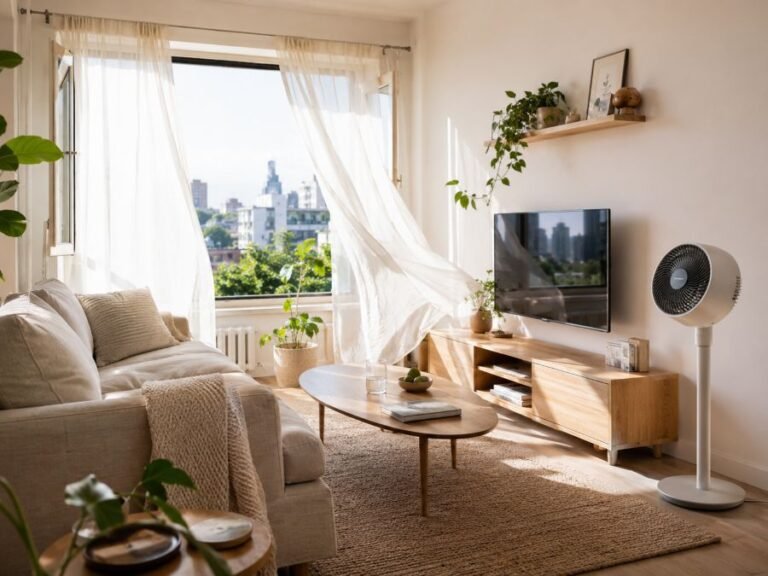
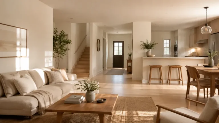
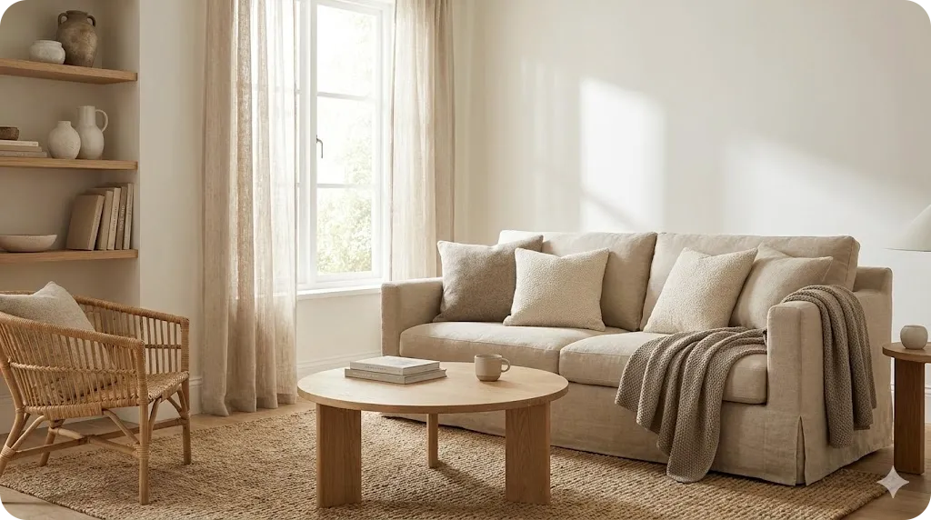
Not every calming palette relies on color in the traditional sense. Warm neutrals — creamy whites, beige, oatmeal, greige, and soft taupe — create some of the most soothing, timeless interiors of all. These shades work because they recede gently, providing a quiet backdrop that lets light, texture, and a few meaningful objects take center stage. Unlike stark, cool whites that can feel sterile, warm neutrals wrap a room in softness and make it feel instantly welcoming.
The art of a neutral palette lies in layering tones and textures so the space feels rich rather than flat. Combine a warm white wall with beige upholstery, a taupe throw, and natural wood and rattan, letting the subtle differences in shade create gentle depth. Because the palette is so quiet, the interest comes from how surfaces feel and catch the light, which keeps a neutral room from ever reading as boring. This approach suits any room and adapts effortlessly as your style evolves over the years.
Earthy and Muted Tones for Cozy Calm
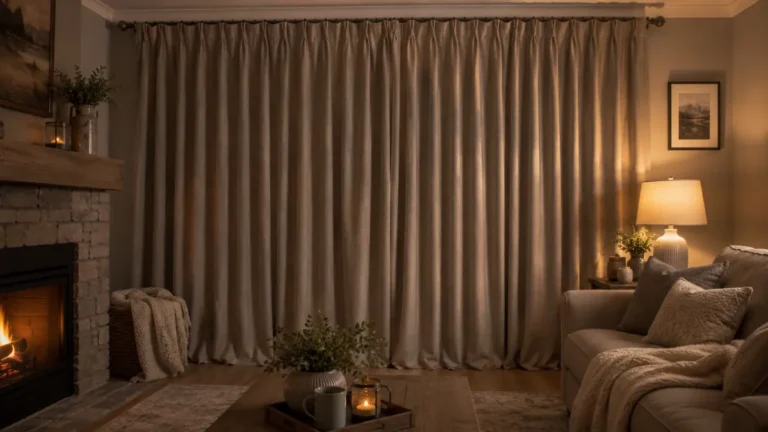
For those who find pure neutrals too quiet, earthy tones offer warmth and personality while staying firmly in calming territory. Soft terracotta, clay, muted ochre, dusty rose, and gentle browns echo the natural world and bring a grounded, enveloping coziness to a room. These shades are especially lovely in spaces where you want comfort and intimacy, like a reading nook or a living room meant for slow evenings, because they feel like a warm embrace rather than a cool retreat.
The key to keeping earthy tones calming rather than intense is to choose muted, dusty versions and use the boldest ones as accents rather than wall-to-wall color. A clay-toned cushion, a terracotta vase, or a single ochre throw can warm up a neutral or green scheme beautifully. If you do want an earthy wall, pick the softest, most muted version you can find, and balance it with plenty of cream, wood, and natural light so the room stays serene and never overwhelming.
How to Build Your Calming Palette
Choosing individual colors is only half the task; combining them well is what creates a truly restful room. The most reliable method is to limit yourself to three or four related tones and assign each a role. Start with one dominant color, usually a soft neutral, to cover the largest surfaces like walls and big furniture. Add one secondary calming color, such as a soft blue or sage, for medium elements like an armchair, curtains, or bedding. Then finish with one gentle accent used sparingly in cushions, art, or ceramics.
Keeping contrast low is what ties everything together. Calming schemes feel cohesive because the tones sit close to one another, letting the eye glide smoothly across the room rather than snagging on sharp differences. Whenever you’re unsure, choose the softer, more muted version of any color, and lean on natural materials and warm lighting to complete the mood. The table below offers a few tried-and-true calming combinations to inspire your own.
| Palette | Core Colors | Best For |
|---|---|---|
| Coastal Calm | Soft sky blue, warm white, sand beige | Bedrooms, bathrooms |
| Garden Retreat | Sage green, cream, natural wood | Living rooms, home offices |
| Warm Sanctuary | Greige, oatmeal, soft taupe | Any room, open-plan spaces |
| Earthy Cocoon | Muted terracotta, cream, soft brown | Reading nooks, cozy lounges |
| Misty Morning | Blue-gray, warm white, pale wood | Bedrooms, quiet corners |
Applying Calming Colors Room by Room
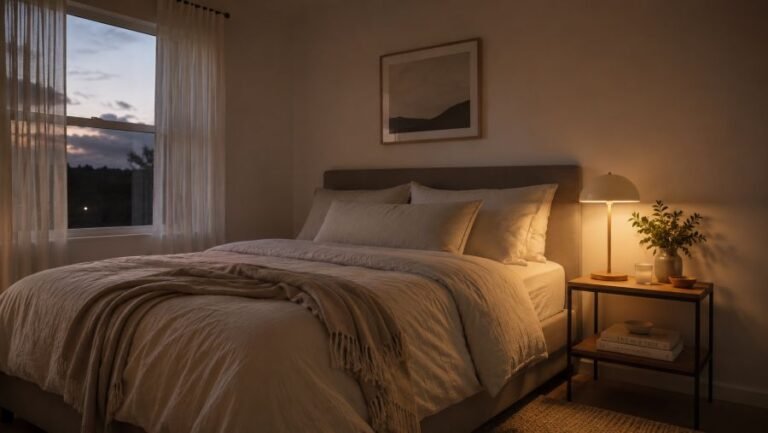
The same calming family can be tuned to suit each room’s purpose. In the bedroom, where rest is everything, lean into the softest, coolest calming tones: muted blues, gentle greens, and warm neutrals all support winding down, especially on the walls and bedding. In the living room, you have more freedom to introduce gentle warmth and a little more depth, since this space balances relaxation with everyday activity; sage, greige, and earthy accents work beautifully here.
Bathrooms shine with spa-like blues, soft greens, and crisp-but-warm whites that evoke cleanliness and calm, while a home office benefits from restful greens that reduce eye strain and support quiet focus. In kitchens and dining areas, warm neutrals and soft sage keep the heart of the home feeling welcoming without being too stimulating. Throughout, the unifying principle is consistency: carrying a shared calming tone from room to room makes an entire home feel cohesive, serene, and intentional, regardless of its size.
Finishing Touches: Light, Texture, and Restraint
A calming palette reaches its full potential only when light and texture support it. Warm lighting around 2700K makes soft colors glow and keeps even cool blues and greens feeling inviting after dark, while harsh, cool-white bulbs can flatten and chill the most carefully chosen shades. During the day, let in as much natural light as possible, since daylight reveals the true softness of calming colors and lifts the whole mood of a space.
Texture is what keeps a quiet palette from feeling flat. Because calming schemes are low in color contrast, contrast in texture does the work instead: pair smooth walls with nubby linen, soft wool, natural wood, and woven baskets to add richness and depth. Finally, remember that restraint is part of the calm. Resist the urge to add too many colors or too much pattern; a peaceful home comes as much from what you leave out as from the soothing shades you choose to put in.
FAQ: Calming Color Palettes for the Home
What are the most calming colors for a home?
Soft, muted tones tend to feel the most calming. Gentle blues and greens are widely associated with relaxation because they echo the sky, water, and nature, while warm neutrals like beige, cream, greige, and soft taupe feel cozy and grounding. The key is to keep the tones muted and low in contrast, since soft, desaturated shades soothe the eye far more than bright, intense ones.
What color is best for a restful bedroom?
Soft blue is often considered the most restful bedroom color, as it is linked to lower heart rate and a sense of calm that supports sleep. Muted greens and warm, earthy neutrals also work beautifully. Whichever family you choose, favor a soft, desaturated version over a bright one, and keep the overall scheme low in contrast for the most peaceful effect.
How many colors should a calming palette have?
A calming palette usually works best with three to four related tones rather than many competing colors. A common approach is one dominant neutral, one soft secondary color, and one gentle accent. Keeping the palette tight and the tones close together helps the eye glide smoothly across the room, which is what creates that cohesive, restful feeling.
Do calming colors work in a home with little natural light?
Yes, but choose your shades carefully. In low-light rooms, lean toward warm calming tones such as soft greige, warm white, and gentle earthy hues, which stay inviting rather than turning cold or gray. Test paint samples on the wall and observe them at different times of day, and pair the color with warm lighting to keep the space feeling soft and serene.
Final Thoughts: Color Your Calm
The colors you live with shape how your home feels far more than any single piece of furniture ever could. By choosing a calming palette built from soft blues, gentle greens, warm neutrals, or muted earth tones, and by keeping contrast low and tones closely related, you can turn any space into a restful sanctuary that quietly lowers your stress every time you walk in. The beauty of color is that it’s one of the most affordable and transformative changes you can make.
Start with the room where you most crave calm, test a few soft shades on the wall, and notice how each one makes you feel at different times of day. Build your palette slowly around the tones that soothe you most, support them with warm light and natural texture, and resist the urge to overcomplicate. Whatever the size or style of your home, the right calming colors can make it feel like the peaceful retreat you deserve to come home to.
ADeL A.A
ADeL A.A is a home décor and space optimization writer who believes every square foot matters. He spends his time researching, testing, and comparing smart storage ideas, multi-functional furniture, and practical layout solutions — always searching for the best ways to make compact homes feel bigger, brighter, and better organized.
View all articles by ADeL A.A →